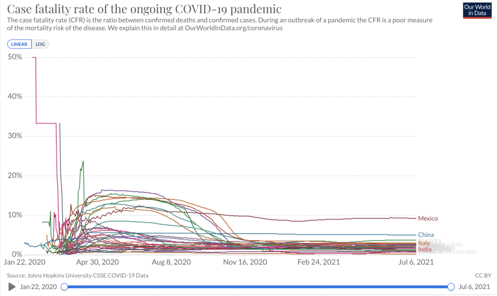
Yesterday, we made these graphs from Our World In Data using the case fatality rate (CFR or the number of people who died after receiving a positive COVID test divided by the number of people who test positive from COVID) from January 2020 to July 6, 2021. What do you see? Keep scrolling to know what our observations and insights are.

From image 1 above, we see that in most (or should we say all?) countries, the CFR has remained relatively flat (with minor movements) since November 16, 2020. That’s despite most governments’ continued insistence that there is no treatment available for COVID. Take note that there were still no vaccines during this time. Can you spot in this graph when the Delta variant became dominant across countries?
The answer is no. Because even if the variant became dominant, it doesn’t mean that it is dangerous or that it is deadly. In fact, evidence from the UK is showing us that the Delta variant is “inconsequential” [also read HART: Good news being ignored by mainstream media, COVID is becoming milder]. It is a very mild variant.
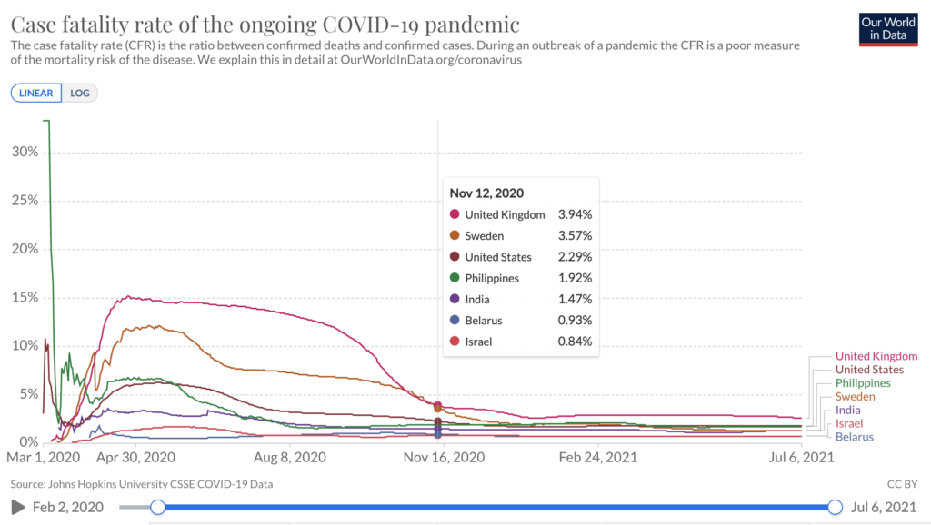
The very first COVID vaccine jab was administered in the UK on December 8, 2020. But as can be seen in image 2, the country’s CFR was already down by then. In fact, even with the massive vax rollout, the CFR has not moved. So if someone tells you that it was the vaccine that caused the drop in deaths, tell them they’re either ignorant of the data, or they are lying. Want to see the graph for the Philippines? Scroll to the next photo.

In this image 2 above, we show the CFR for the UK, US, Israel, India, Philippines, Sweden, and Belarus. Here are the things to take note of here:
- Israel has had one of the lowest CFRs since the start of the pandemic. Their CFR has stabilized as early as August.
- Belarus never locked down, but it has one of the lowest death rates in the world. Except for a short “surge” in late March, the country’s COVID CFR has always remained at below 1%.
- India has an even lower CFR compared to the Philippines, despite international organizations saying that they should have millions of people die daily.
- Sweden has a high CFR during this time. Note, however, that unlike other countries, Sweden does not do mass testing. Their testing protocol is very targeted and was limited only to those who are experiencing symptoms of the disease or are contacts of symptomatic cases. This is the best practice for the use of RT-PCR as this was one way they could prevent false positives and maintain the reliability of the test. To see how these countries are faring now, scroll to next photo.

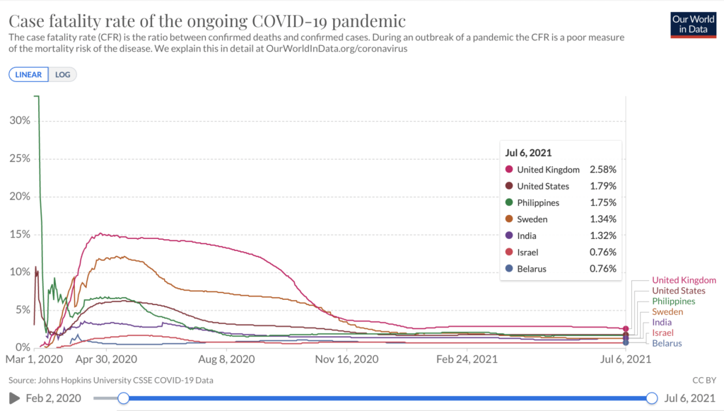
Image 3 features the CFR of the same countries from image 2. As of July 6, 2021, the US, UK, and the Philippines hold the 3 highest CFRs in this sample of countries. Now, look at where Sweden and Belarus are. Despite not implementing stringent coronavirus measures as the UK, US, and the Philippines, Sweden has a much lower death rate. Look at where India is. Everyone has been panicking about India, but it turns out that it is still doing better than the more developed countries.
Do you see any reason why you should panic for this delta, kappa, lambda, etc. variant?
Are people saying that the UK and the US, both of which have an even higher CFR than the Philippines, can reopen and remove all their restrictions just because they have higher vaccination rates, and we can’t just because our vaccination rate is low? What is the rationale for this? Because as far as deaths go, there has been no real change in all three countries. And Farr’s law says that in the case of epidemics, the only thing that is real is deaths. Scroll to the next photo to read our conclusion.

Can someone remind me again why we had to lockdown, and why we continue to have these restrictions? Can someone from the government please tell me, what is the exit plan of the Philippines?
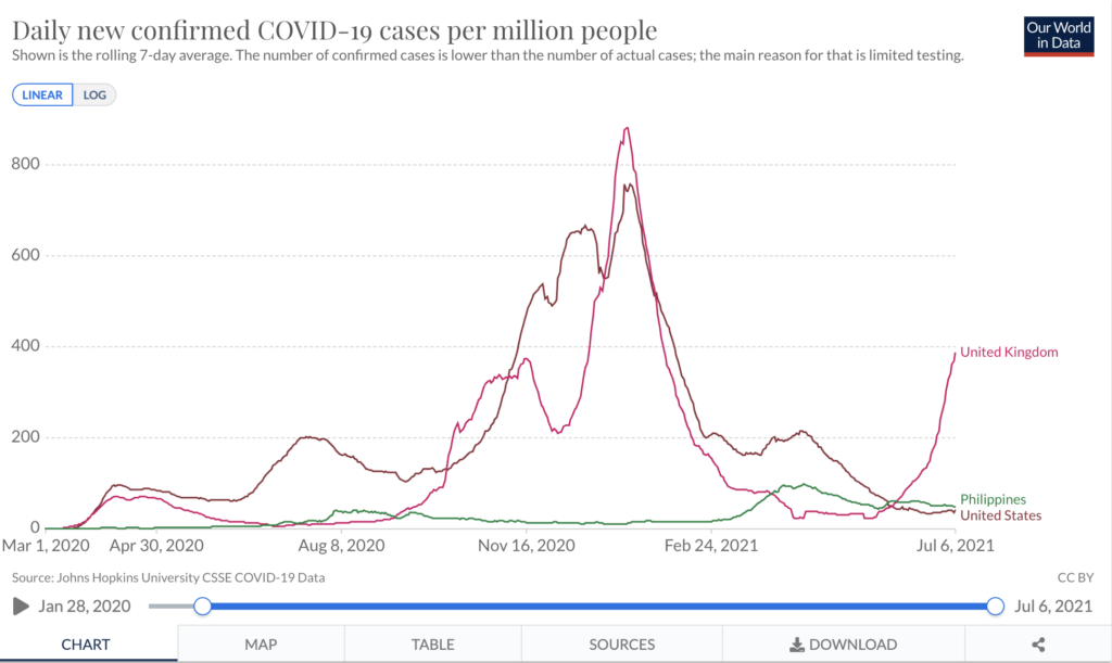
What indicators are you looking at to say that it is safe to reopen? If you say, the number of cases in the Philippines is still increasing, well, please look at the graph in image 4. Adjusted per million people, the number of test-positives in the country is still much lower than the UK and US, which as you can remember from the previous graph (image 3), has even higher death rates compared to us.
The UK’s cases are increasing despite more than 50% of their population already fully vaccinated. And yet, they are now lifting all coronavirus restrictions.
The US has decreasing cases, and yet the CDC has recently given notice that mask mandates will return again.
So from this graph alone, you’ll see that the number of “cases” cannot be used as a measure for the “end” of the pandemic. What is then? Shouldn’t we all be asking questions now?
